The power of branding
Deciding over the name of our company has been an arduous task: to make a long story short, we wanted to be identified as a system capable of developing cutting-edge industrial projects, where engineering could be expressed as a Global System Engineering for the international markets.
The three words we chose were those that best represented both the buzzing historical period and our essence: European to assert our support to a United Europe and to pay homage to the restless winds of freedom we all lived; Industrial to express our own technological and industrial knowledge, as well as our credit to the on-going IT revolution; Engineering to undeline our peculiar approach and contribution to the world. And thus European Industrial Engineering saw the light.
We knew that we were somehow defying marketing rules and that the name would immediately be criticized: too long, too complex, the acronym EIE not fluent to an English reading.
The definition of the logo has not been less articulated: we wanted a symbol that would evoke intense emotions, a pattern that would make an impression rather than just tell a story.
We were looking for a universal and extemporal logo that would be at the same time the vehicle of a message and the message itself: a brand and a concept at once.
We thus chose to use the letters of the acronym only in order to refer to the company’s name directly, but most importantly to convey its essence. We focused on the centrality of the “Industrial service” given.
Thus the two E “embraced” the I

Since working proposals were quickly moving forward, we decided for a homemade solution to temporarily represent our company. At the same time, we worked with a graphic designer at the new brand. Once ready. It got contrasting opinions, but certainly it stood out for its peculiar visibility.
By de-structuring the two Es into two wings, the idea of the embrace was emphasized, standing as a real support to the I that represented the capacity of being a vehicle of industry processes.
Colors as well were carefully taken into consideration, starting with those that were in vogue at the time: orange, violet and yellow. But then we wanted to top that.
The Bhopal disaster, which occurred in India in 1984; the huge nuclear power plant accident in Černobyl, Ukraine in 1986 and the accident of the Exxon-Valdez oil spill in Alaska, in 1989, vividly lingered in our minds.
So, for the following graphics, we chose the light blue of the sky and the green of the fields, to underline our respect for the environment and our balance with nature, while the technological innovation was symbolized in a classic grey.
We immediately liked the two de-structured Es: segments of wings, accents and apostrophes. We also had to represent the four divisions of the company, so we associated a different color of the logo to each one: grey for the Structure Division, light blue for the Mechanics one and green for the Plants one.
But our goal was also to get soon to the constitution of a Special Products division and for that we chose red.
In 1994 we produced an institutional brochure to celebrate our company’s fifth year and we prepared a new version of the brand, a symbol which had a strong local rooting: el leon in moeca of the Serenissima Republic of Venice.
The year 1999 was marked by another major goal: the entrance of EIE in Radio Astronomy, with the award of the first antenna prototype for the ALMA - Atacama Large Millimeter/Sub-millimeter Array Project. We felt the need to renovate, both in terms of the organizational structure and of presence on the markets, and we did that with a brand-new image.
We launched a global project: a new better-structured internal organization and a new icon, capable of representing the industrial trail developed thus far and to represent our future expectations.
The elements characterizing the planet Earth became the new theme of EIE identity system. As if we were in outer space, where our telescopes look down on us and from where we see the colors of our planet.
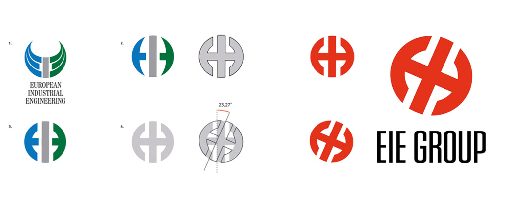
The graphic redefinition of our brand identity followed different phases:
The Brand Restyling: the sign and the font of the logo were reviewed to communicate modernity and innovation, through a coherent and neat use of its graphic identity elements, in continuity with the image of the past. As the Earth is not a perfect sphere, but an ellipse flattened at the poles, we decided for a logo presenting similar flattening and inclination: at the moment, the tilt of Earth axe is between 23º and 27’, which is the same tilt represented on the logo.
EIE new logo: It is red like the Special Products Division which recalls the idea of a certain completeness: from the conceptual idea of a project to its development.
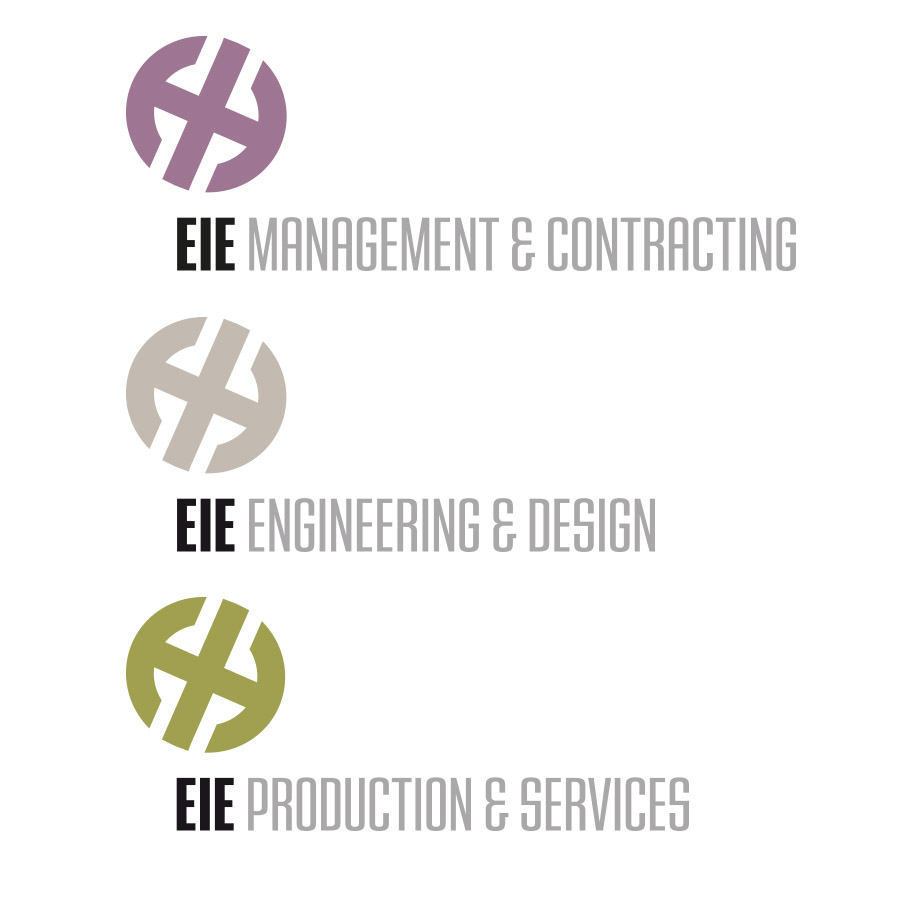
For the three main entities we decided to maintain the colours of the Earth, as they are visible from the Space:
Violet: for EIE Management & Contracting.
Grey: for EIE Engineering & Design.
Green: for EIE Production & Services.
This is our logo today. The addition of the word “GROUP" identifies the prefix of the logotypes of all the Companies, to graphically assert the new Corporate asset.
This is our logo today and it represents our evolution, still remaining loyal to the key values of efficiency, innovation, research, culture and partnership, we have believed in since the beginning of our story. It distinguishes us as a company that has been able to tune in to respond to the needs, sometimes to the dreams, of ambitious scientists, opening to the continuous market developments. Today EIE GROUP is a dynamic integrated company, which keeps evolving, and which is capable of networking with all its different stakeholders.
Note: EIE GROUP logos cannot be used without permission.
If you have any questions regarding logo use, please contact us at: media@eie.it
- There seems to be no real English translation for the term ‘moeca’, which in the Venetian dialect, indicates the crab in a particular period of its life, when it abandons the old shell, but it still hasn’t regenerated the new one. During this phase, crabs are particularly soft and tender (‘moeca’ means soft), and in fact they are a typical delicious Venetian specialty.
But the Venetian “leon in moeca” has also a symbolic meaning. It seems that "Leon in moeca" comes from the frontal position the lion is usually represented, with the bible in his paws. We call it moeca, because it recalls the behavior of the adult crab: when the haunt doesn’t end well, it attacks the younger crabs which are weaker and softer due to the molt. When it happens that the prey is not sufficiently soft (moeca), it holds it between the abdominal appendix and the claws, till the time comes to eat it up. It’s quite plausible therefore, that the “leon in moeca” derives from this position.